A Case Study on Intersection Points
You don’t always need a lot of pieces or competing elements to create a strong look. Strong looks come from defined visual breaks, fluidity, meaningful connections and interruptions in the composition.
If you are not mindful of those styling concepts, then it’s easy to become overstyled. I notice overstyling happens mostly at intersection points- the points where pieces meet. That space is so important in styling because that space is a visual cue for the eye to rest and interpret. When you overload intersections, the dynamic is lost.
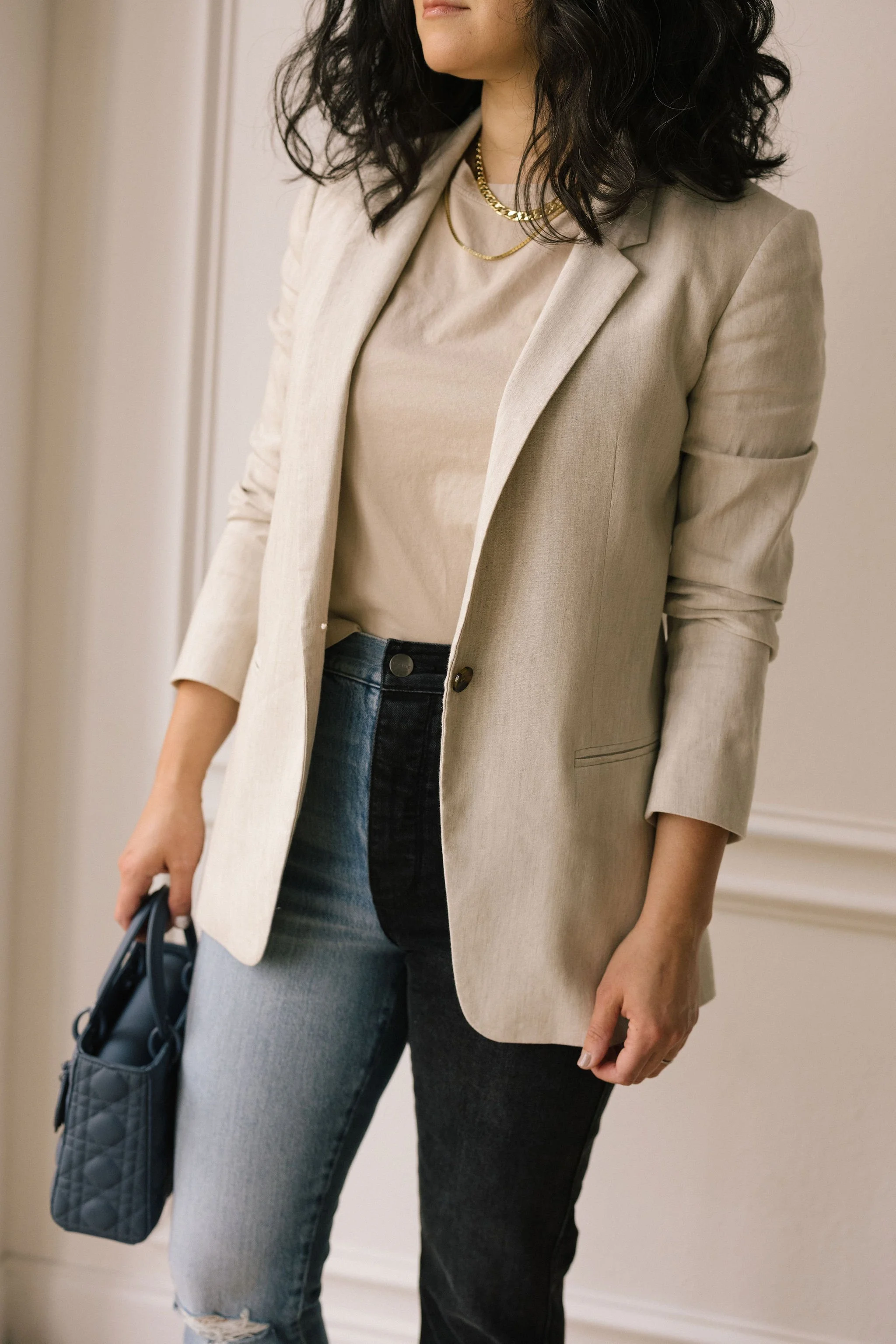
I think this two-tone denim from Frame could be very easy to overstyle, so I’m using it as a case study to show how to style with intersection points in mind.
Here’s how I approached the styling:
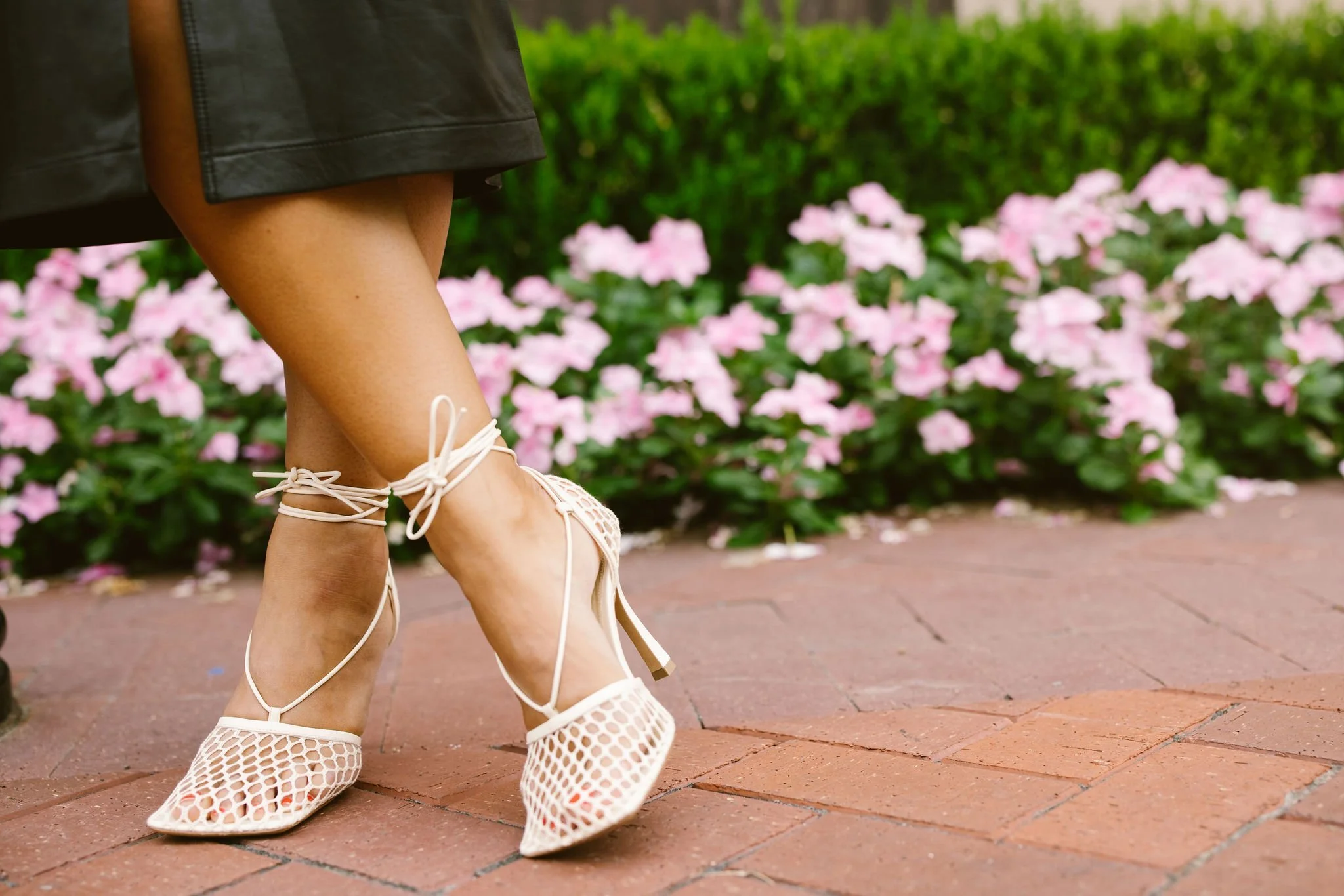
To strengthen the impact of the pant, I chose to repeat the black and denim blue palette with accessories. While they support the main character (the pant) in color, they have a side conversation by sharing a grid shape and texture. It’s also important to note that this shoe works because of the visual break (bare ankles) between the denim and the shoe.
I intentionally did not choose a black, light blue or denim top because it creates an odd, imbalanced shape, like the letter P. I already knew I wanted to include the bag and sandal, so in order to keep a soft but tight palette, I chose to use a parchment colored top. I like that there is contrast at the intersection point at the waistband and because of the power of 3; it reads as balanced tension.
For added depth and dimension, I added a top layer with a color matching blazer. I think this adds just enough depth that we want, but much like the top, quietly sits next to the denim. Doing this topper in another color would have created a competitive focal point that would overload the eye.
Added sparkle at the neckline for interest- and it helps that the parchment color has a neutralizing effect!
What do you think? Would you have added a belt or replaced the parchment color with optic white? Do you think there is space for another color in this palette? Let me know in the comments!

